TypeDashboard Design
Year2026
Scroll↓ Case Study
PlatformWeb · Figma
Oasis Hotels & Resorts
OASIS
Dashboard DesignHotel OpsUX / UI
Scroll
Staff
85
employees managed
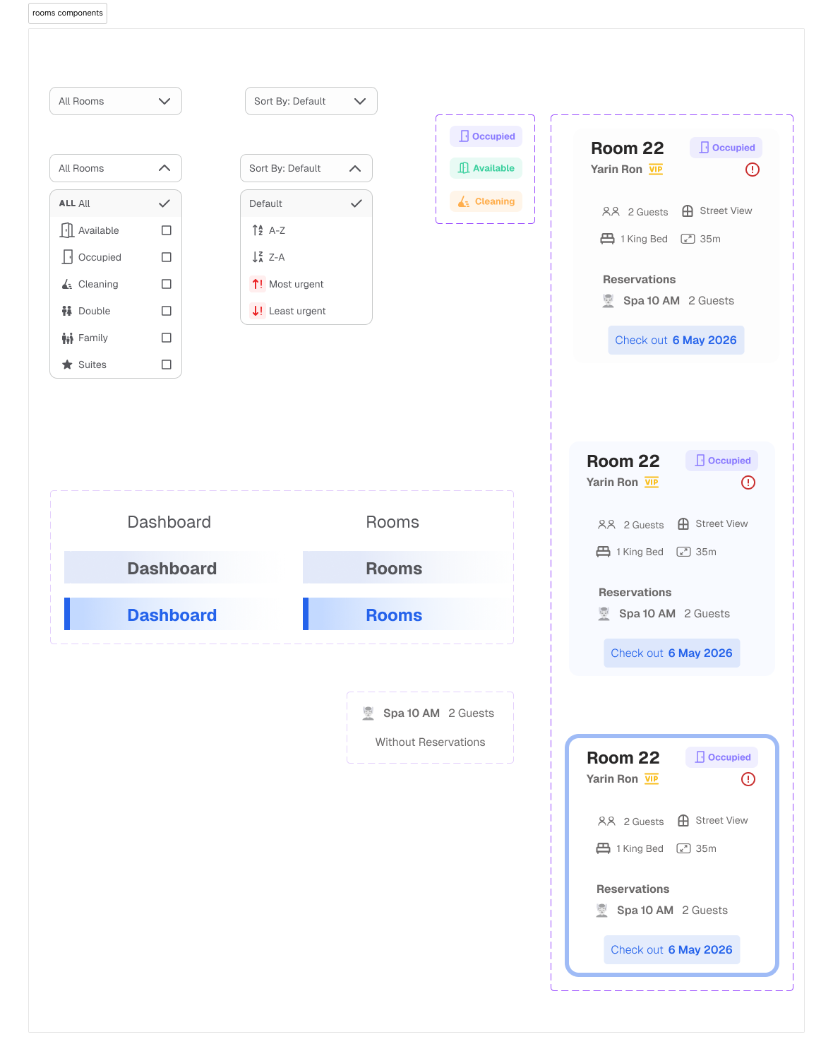
Rooms
40
rooms tracked live
Shifts
3
daily shifts coordinated
Depts
6
departments in one view
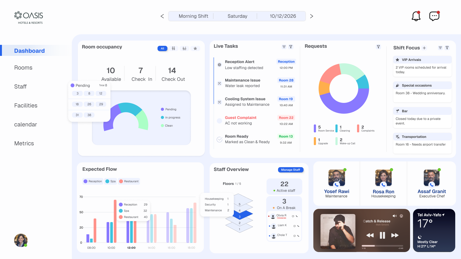
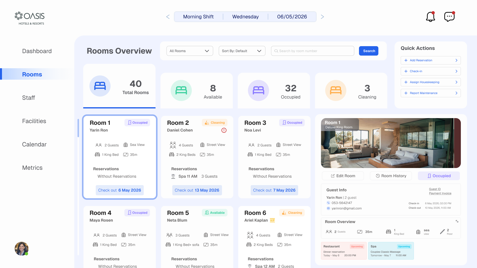
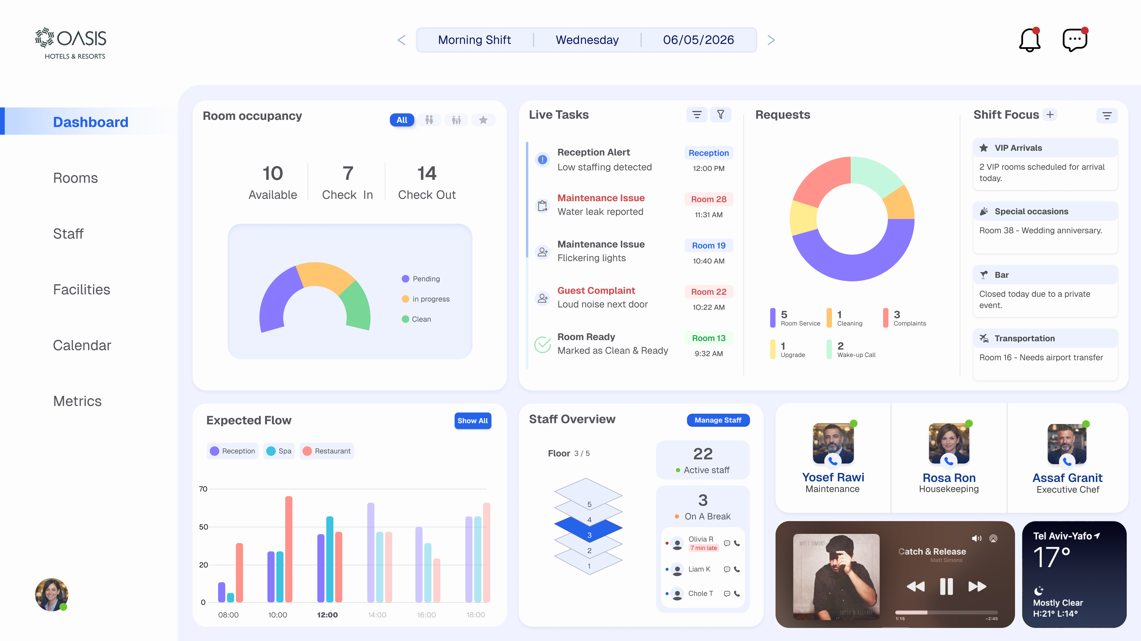
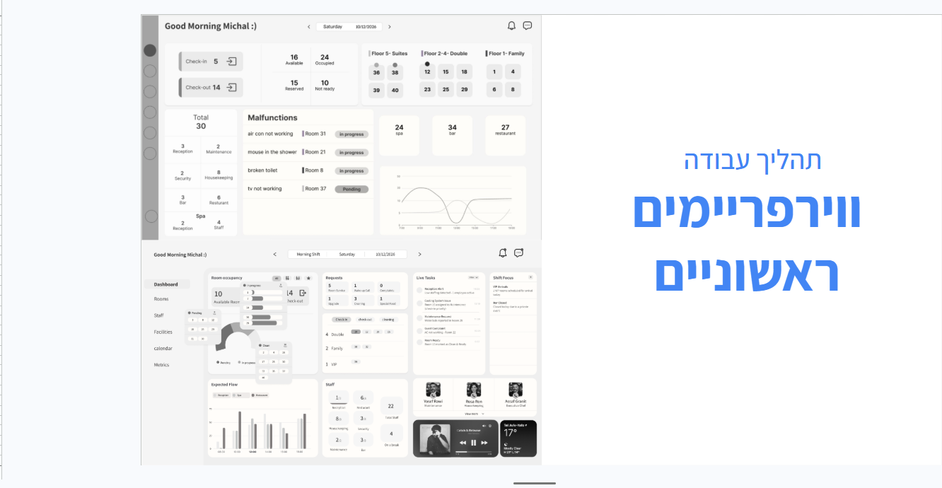
Live Dashboard